
Concept
A conventional chart requires choosing one or two axes before you look. With more than two informative numeric columns, the joint structure across all of them is invisible to any single chart unless you already know which two columns matter — which is usually the thing you are trying to find out.
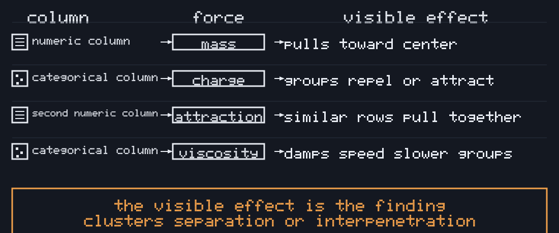
A force-settled layout is a physically legible multivariate embedding: every mapped column contributes a force simultaneously, and the settled position of a point is jointly determined by all of them at once, not by two chosen axes.
The mechanism
What this earns that a bar chart or scatter plot cannot
- Clusters across more than two columns — points that agree on several attraction-mapped columns converge physically, even when no single pair of columns would separate them in a 2D scatter.
- Outliers as a physical fact — a point far from everything on the mapped dimensions fails to find a stable position near any cluster and visibly ends up at the periphery, distinct from a boxplot's single-column-at-a-time test.
- Whether two columns actually correlate — map one to attraction and another to spring stiffness; a layout that settles calmly says they pull together, one that stays jittery says they don't.
- Group separation as a real test — a categorical column mapped to charge sign physically repels its groups apart if the other mapped columns actually support that separation. Interpenetration is a finding, not a rendering failure.
How the claim is measured, not asserted
Every session computes a separation-gain number: the best-achievable 2-axis view (silhouette score of a k-means assignment on the top-2 PCA components of the mapped numeric columns) versus the same silhouette score computed on the final settled physics positions, at the same k. k-means here is an internal scoring tool only — it never drives the rendered layout.
physicsSilhouette − pca2dSilhouette ≤ 0.20→ “No meaningful gain over a 2-axis view” — a scatter plot would show you the same thing. Both raw numbers are always shown, win or lose.> 0.20→ “Physics separates this data better than the best 2-axis view” — these columns are doing joint work no single scatter plot shows.
That 0.20 line is deliberately conservative — raised from an initial 0.05 after measuring that k-means silhouette shows real apparent structure even in pure noise, and that a physics-settled layout is more prone to that false signal than a flat PCA projection is. Full measured account on /docs/limitations.
This is a mechanism, not a promise: the CI eval suite (evals/) pins both bundled synthetic fixtures to their honestly-measured verdicts — even the 3-known-cluster dataset, engineered with obviously separated blobs, correctly comes back “no meaningful gain” at this threshold (see /docs/limitations for the full account), same as the genuinely random one. The “stronger” verdict path itself is verified separately, directly, against constructed inputs (src/core/separation-gain.test.ts) — so a change that quietly breaks either the comparison logic or a pinned fixture's honest number fails CI before it ships a page whose central sentence is no longer true.